Simple Contact Form Changes for Better Conversion
Imagine a stranger walked up to you in a social setting and asked: I don’t know you but…
- What’s your full name?
- What’s your email address
- What’s your phone number?
- What’s your physical address?
Then they ask why you’re here and what you’re interested in.
Your reaction might be similar to what you see below:

Oh puhleease!
Now reverse that conversation.
- Hello, how are you enjoying yourself?
- What is inspiring you about this place?
- What are you here for?
It’s immediately more engaging, less forceful, and you might be interested in a deeper conversation.

Then that same stranger says great, I’d like to make your visit better, let’s swap contact info and keep in touch.
And that’s the essence of what this post is about when it comes to contact forms. You’ll learn some easy ways to make your forms more friendly and get your visitors clicking submit.
A Brief History of Web Forms
A web form, or HTML form, on a web page allows a user to enter data that is sent to a server for processing. In the early days of the internet, most forms all looked like this.
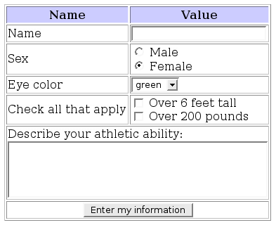
Then Dave Raggett came along. He created the form tag in HTML.
He’s a computer specialist who has played a major role in implementing the World Wide Web since 1992. He’s worked on many of the key web protocols, including HTTP, HTML, XHTML, MathML, XForms and more.
Thanks, Dave!

Factors to Consider When Building Forms
Forms (and the web) have come a long way since those early days. They can look any way you want them to look through CSS styling and many are highly interactive.
But at the end of the day, the goal of any form is for the user to actually submit the data you’re asking for, and there are simple ways you can ensure your visitors take that action.
Whatever you do… don’t do this.

Do you see the form on this page? If you haven’t found it yet, there’s a search form directly underneath the karaoke videos.
Now this is an extreme example, and from what I’ve read Lingscars.com gets a ton of traffic and business because it is so fun and memorable, but this is the exception.
The point I’m making is that you should ensure that your form is easily seen and should be obvious within the content surrounding it. In fact, in most cases it should be the only content on your page.
Size and Steps
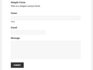
The size of your fields and number of steps in your forms makes a difference. If your form requires a lot of information, consider splitting it into multiple steps.
- Are the fields spaced well?
- Are fields positioned horizontally, vertically, or both?
- Are you asking for information that really isn’t necessary?
Fields and Labels
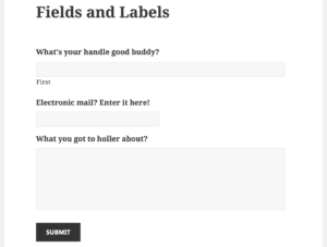
Many forms have these default fields and labels; Name, Email, Reason for Contact. That’s boring and not inviting for the end user. Here are a couple of tips for getting more personal with your form field labels.
- Consider the language used – Does it “FEEL” inviting? Personal?
- Are the words targeting your visitor market?
The goal is to make an initial connection by using the language that your visitors might use.
Appropriate Field Types
I’ve seen and done this myself. I’ve asked a user for multiple answers and then used radio buttons which only allow one selection at a time!
Make sure that you don’t make the same simple mistake. Use the appropriate field types for the answers you’re seeking.
- radiobutton – used to select a single option amongst two or more
- checkbox – allows multiple options to be selected
- drop-down list – also used to select a single option from a list of them
- date – uses a mini-calendar control to allow the user to select a date
- textarea or large text fields (several lines) – used for larger amounts of text than is possible using the basic text input field
Benefits
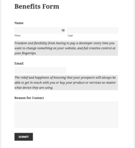
Reminding your visitor of the benefits they’ll get after filling out and submitting your form is an easy way to gently guide them to the submit button. You’re creating an emotional investment when it matters most.
- What’s in it for them?
- What happens after they submit?
Trust and Confidence
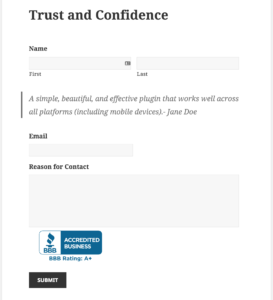
Using your forms as an opportunity to build trust is something so simple, but that many people miss. You can do this a few ways by including any of the following:
- Include testimonials. Written. Video. Even audio.
- Better Business Bureau seal or similar “social proof.”
By including these, you’re helping to ease any doubt the visitor may have before submitting their information.
Call to Action

We’ve all seen the traditional call-to-action buttons, but the key here is to test different words and phrases used on the submit button.
“Submit,” “Register” or “Download” are all three button texts that are known for lower conversion rates. Think about the language your target demographic might use and include (and test) those words and phrases.
How Are Your Forms Converting?
By implementing some of these simple changes to your contact forms, you can increase the number of submissions you receive. As always, you should use A/B testing of your changes to ensure that what you’re changing is actually working as you expect.
We’ll be posting more in the near future about form conversion, testing and the tools we like for creating forms in WordPress, so stay tuned.
And don’t forget: form fields can create potential vulnerabilities for your website if they aren’t properly sanitized. Practice filling out the form to contact SiteLock at the WP District and our website security specialists can help you keep your website and visitors safe.


